Colour can help you to feel and look confident, as well as healthy, vibrant and yes, even younger! Yet many people steer away from wearing colour fearing that they’ll get it ‘wrong’.
Even in these rather surreal times where we are all staying at home, wearing something a little bit more colourful could actually lift your mood. The topic of colour psychology is fascinating – perhaps something I’ll elaborate on in a future blog if you’re interested, (let me know here)? In the meantime, here’s an explanation of how colour analysis works and how you can choose the colours that suit your physical colouring.
How to choose colours that suit you

Image credit: Munsell Wikipedia
Colour analysis is based upon the Munsell Colour System, which categorises colours according to their value (depth – ie., how light or dark they are), their hue (undertone – ie., how warm or cool they are) and their chroma (clarity – ie., how bright or muted they are).
It’s a system that is used universally across many creative industries. If you have your hair coloured, your hairdresser will be able to describe the colour of your hair by referring to its depth and undertone, for example. Or if you select paint for your walls, you’ll be only too familiar with the vast array of colours you can choose or have mixed these days. Each has a numerical code which relates to the Munsell system.
When it comes to choosing colours of clothes, the idea is to wear colours that harmonise with your own colouring. This will make you look healthy and vibrant and not drained or looking like you need a holiday! So when doing a colour consultation, I look at the colour of your hair, the undertone of your skin, the colour of your eyes and the colour of your eye brows. Each of these elements will contribute to your overall look.
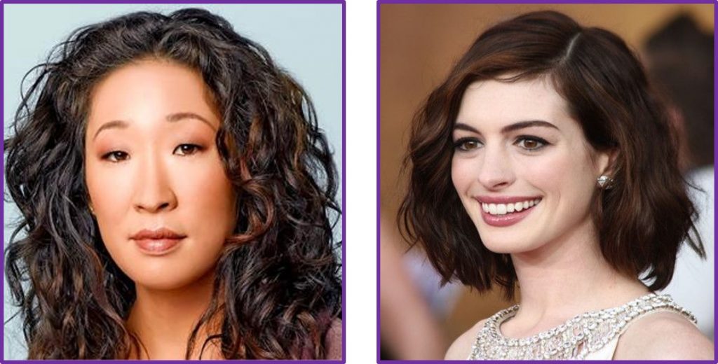
One of the three aspects, of depth, undertone or clarity, will be the most dominant. If you have very dark hair, dark eyes and dark eyebrows, for example, it’s more than likely that it’s the depth of your look that will be the most striking aspect of your appearance. You will be a ‘Deep’ colouring type, so wearing stronger, deeper colours will always be more flattering than anything too pale. However, it could be that you have a warm golden skin tone on one hand or a cool pinky or sallow skin tone on the other. This will make a big difference to the undertone of the Deep colours that will suit you – you will either suit ‘Deep+Warm’ or ‘Deep+Cool’ colours best. Sandra Oh has deep features with a warmer skin tone, for example, so will suit the Deep+Warm palette of colours, whereas Anna Hathaway has deep features with a lovely cool porcelain skin tone, so suits the Deep+Cool palette.
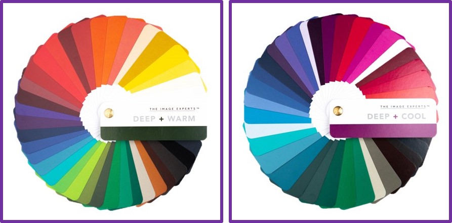
It’s not always as straight forward as this. Even for those with dark hair and dark eyes, it might be that on looking at your colouring more closely we notice that your eyes really ‘pop’, that’s to say that the whites around your dark eyes make them stand out, giving you a contrasting look. In this case, you may suit one of the Bright palettes better – Bright+Warm or Bright+Cool.
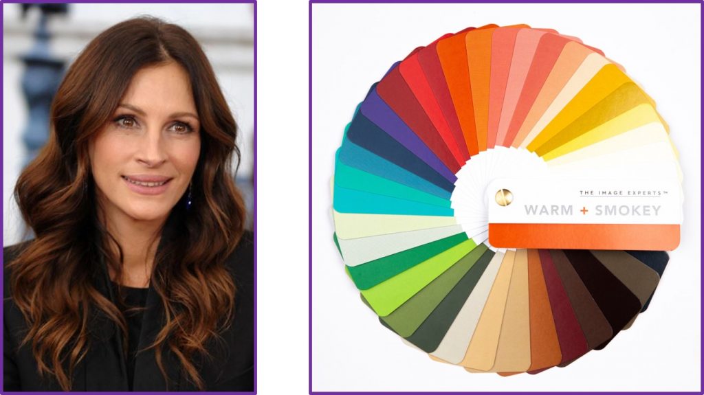
Or maybe there’s such warmth to your dark hair, combined with warm brown/green eyes and a warm skin tone, that it’s the warmth rather than depth that is more striking about your appearance. In this case,you may well suit one of the Warm palettes better. In this photo, Julia Roberts looks to have real warmth to her dark hair, so I would test the palettes to see whether the Deep+Warm or Warm+Smokey palettes worked best for her.
It’s all a matter of looking at your features and deciding which is the most obvious thing about your look. So take a look in the mirror and ask yourself:
- are my features mostly light or dark?
- do I have obvious warmth or coolness to my look?
- do I have a lot of contrast in my features (e.g., dark hair with a light/bright eye) or rather more blended features (e.g., mid depth hair and softer eyes)?
Which of these three characteristics hits you most vividly as you look at yourself? If it’s the depth of your look, you’re probably a Light (Light+Warm or Light+Deep) or a Deep (Deep+Warm or Deep+Cool). If it’s the warmth or coolness of your look, you’re most likely a Warm (Warm+Bright or Warm+Smokey) or a Cool (Cool+Bright or Cool+Smokey) type. Finally, if you have a lot of contrast in your features you’ll be a Bright (Bright+Warm or Bright+Cool) or alternatively if you have mid-depth hair and blended features you’ll probably be a Smokey (Smokey+Warm or Smokey+Cool) type.
The 12 colouring types
Here are a few examples of those that fall into each of the 12 colouring types:


Can you work out which colouring type you are? If so, it’ll give you a good idea of the colours that will suit you.
LIGHTS – If you have a Light look, then wearing lighter colours up near your face will be the most flattering – Spring/Summer is usually a great time of year for you to shop! Remember that your skin tone will make a difference as to whether you look best in Light+Warm colours, like a warm peach/coral for example, or the Light+Cool baby/rose pinks.
DEEPS – as I explained before, you’ll look best in deep, rich shades that harmonise with the depth of your look. You’ll look lovely in deep purples, damsons, reds, strong blues etc. depending on your skin tone, if this is you. Choose a deep forest green if you have Deep+Warm colouring, for example, or a deep bluey pine green if you are Deep+Cool.
WARMS – it’s all about getting the undertone of your colours right, so choose colours with a yellow bias, those that have a warm golden undertone. If you have a brightness to your look (Warm+Bright), choose brighter shades, like lime green for example, rather than the smokey moss greens that will suit you if you have a softer warm (Warm+Smokey) look. Browns and Olive greens are great neutrals.
COOLS – you need to choose colours with a blue bias, such as pinks, blues, raspberry reds, greys etc. The brightness of these colours depends on the degree of contrast in your look. Stick to rose pinks if you have little contrast (Cool+Smokey), for example, or wear a bright fuchsia pink if you have a brighter (Cool+Bright) look.
BRIGHTS – you have a high degree of contrast to your look and so will look great wearing contrasting colour combinations (eg pairing a dark colour with a light colour), or by wearing bright colours like bright red, cobalt blue, bright turquoise, bright greens etc. Choose the undertone of your bright colours that suits you best, so a bright orangey red will be best if you have warm skin tone (Bright+Warm), for example, or choose a bright blue-red if you have cool skin tone (Bright+Cool).
SMOKEYS – your mid-depth hair colour and softer features mean that you’ll look great in the mid-depth, subtle, rather than vivid, colours. Things like an airforce blue rather than colbalt blue, jade green rather than bright green, soft reds rather than pillar box reds etc. will all look fabulous. Remember to choose shades to flatter your skin tone – warmer tones if you are Smokey+ Warm and cooler if you are Smokey+Cool.
And here’s the difference it can make – as a Bright+Warm, I look so much better in the last two photographs wearing either the brighter warm Lapis Blue jacket or the dark navy jacket (which creates high contrast with the white blouse).

Your colour fan for just £25
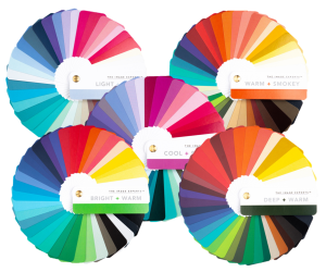 If you know your colouring type and would like to buy a Colour Fan for just £25, just send me a quick email – buy my fan.
The fan is a great tool to help you sort your wardrobe, create colour combinations before putting together your outfits or as a guide for clothes shopping.
Each Colour Fan contains the 36 colours that will suit you best in terms of their depth, hue and clarity. They’re shown here fanned out but closed are a compact 11cm x 4cm x 1.5cm, perfect to slip into your handbag or briefcase.
Ready to enjoy a colour analysis consultation?
I offer virtual and, when Covid restrictions allow, face-to-face colour consultations. Click here to book a face-to-face consultation – for women, for men. Or if you’d prefer to enjoy a consultation from the comfort of your own home, click here: Virtual Colour Analysis.
Finally, as I always say, it’s also 100% important to take into account your personality and lifestyle. Your colours need to be an expression of YOU first and foremost.